Time tracking reports redesign in Keeping
Keeping (keeping.nl) is a time tracking application developed by Label305. The application allows logging of projects, tasks, clients, integrations and more. The logged entries are summarized in reports for further insight. However, only 60.7% of questioned users (N=84) understood how the reports worked: I created a redesign for these pages that was found to increase usability scores and that has since then been implemented.

As a UX designer, I first wanted to define the problem space clearly. I was interested in how people navigated through the website and what their mental models looked like. I started writing down all my own observations and performed a small usability test (N=5) where users needed to perform three common tasks, using a thinking-aloud protocol. I also looked at applications of competitors and a previous Keeping questionnaire filled in by 101 users. Five goals were identified for the redesign:
- Improving date management: changing the time unit easily and going back and forth using this unit.
- Improving consistency of design elements and their placement.
- Creating a clear overview: the website used a tab-structure to go deeper into detail, but users lose track of how deep they are in the navigation and how tab combinations work together.
- The possibility to filter quickly instead of needing many clicks.
- Adding meaningful visualisations, whereas now everything is in text format.
After creating these goals, I began drawing low-fi prototypes, then creating more high-fi mock ups. Because I was working on a redesign, I had to study the current design language and make this my own. There were no documents that contained all design elements, so I created these for reference.

Improving date management was an important subgoal in improving the application. There were elements that were placed too far apart and confused users because they weren't grouped together, losing their meaning. Some arrows were also ambiguous on whether they meant going to a previous page or a previous time unit. To create more cohesion, we placed the date in the center of the page and moved the arrows closer around it. Hovering over the date now creates an underline, indicating that the date can be clicked on. This opens up a dropdown in which days, weeks, months, quartiles, years and custom dates can be selected with a few clicks. The image above displays several examples of its layout.
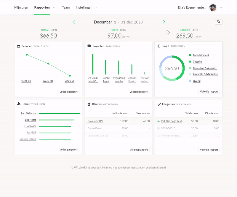
The biggest change of the redesign is the transition from tabs to a dashboard layout (see video). The dashboard boxes contain five entries for each possible logging type (users, projects, tasks, clients, integrations). Clicking on a box leads to a detailed report page, where the visualisation from the box is displayed in full, including a list with the information in text form. Clicking on specific elements from the graph or list leads to a deeper dashboard of information. The user's path can be seen in a breadcrumb in the top part of the page, under the date picker. For experienced users who know what they are searching for, we have introduced a filter bar on the top, which is customised to allow easy filtering for the different logging types. All sorts of combinations are possible.
At the end of the internship, fully clickable prototypes were tested by 20 users. Both versions were presented in mock-up form. The main finding was that the flow of the application was better understood for the redesign with the dashboard than the (then current) tab version. The System Usability Scale also improved with 75.6 against 69.1. For reference, 68 entails a just-above average score (50th percentile). A score of 75 means that the website scores better than 73% of all the thousands of websites that the scale is based on!
Please note that this post is only a small part of all the changes that were made for the redesign of Keeping. A blogpost can be found here to read about all the changes in even more detail.